Iconstop - a massive all purpose iconset

Icons, although seems banal & insignificant on the bigger scale of things, can actually make or break a situation. And yes, finding the right one in the pool of thousands can be tedious & frustrating. Here is an attempt to solve the problem & bridge the gap, more from the perspective of Iconography, keeping in mind the needs of a modern day UX/UI designer.
Project Type
Personal Side Project
My Role
Research, Illustration, Design Direction
Duration
4 Months

Overview

So there isn’t any lack of icons in the internet. You name it and you’ll find it. However the problem is in the consistency & coherence of the icons that you need.
Chances are that most of the times, we as designers do not find all the icons that we need from the same visual style. And thats when things start looking out of place, and in no time, we have a 100 different icons with different visual styles & characteristics.
Hence, after facing this issue for a long time, it was time for taking up this bold & challenging task of creating a massive icon pack, with few different styles & sizes, and sharing it to the world, so that designers don’t have to break their heads over the icons, and instead can focus on bigger things.

Issue with online icons

Although we get any icons available online for free in seconds, but the issue remains with the homogeneity of the icons.
Below are some random examples of icons downloaded online, for a project. Even though, they are all of the same sizes, the inconsistency in the visual style and properties are quite evident.
As we can clearly see, that if we try finding icons from different libraries accross the internet, we may end up having quite a mix of different styles, which may not be a pleasant experience from the visual perspective.
Now of course, we can try looking for icons with the same styles and properties, but then it would definitely take us way more time & bandwidth. And to do that again & again for every new project, would add up to ton of repetitive effort. But again, there are places like material icons where they have everything consistent, but it seemed that their list isn't very exhaustive and at the same time, they have some constraints in terms of thickness & shapes, which might not fit in for every project.

Process & steps

Although design is an iterative process, here are few of the steps taken in reaching the end-result. And the process has never been strictly linear.

Grid & guidelines

The most important part of creating an icon set is to make sure that they follow a consistent visual identity. And theres no better way to start with a foundational grid.
All icons are based on a pixel based grid with consistent margin & bleed area
After researching into a lot of icon grid & guidelines, a custom grid was created (which in a lot of ways is inspired by Google Material Design) and customised it for each size of icons, be it 32, 24 or 16px, to efficiently accommodate the icons for the respective sizes.

Styles & variation

Having the icons in 1 specific size & style might not have helped a lot, as every project has a slightly different requirement. So there are few different options & variations to each icons, with distinct styles.
Line & Fill icons
Outline & fill options are both needed for most projects, so both options had to be created for each & every icon. The outline & fill icons have minute differences in their styles as well to make sure they work really well in terms of legibility.
3 standard sizes for all types of scales
After a lot of research, feedbacks, and back & forth, the 3 industry standard sizes - 16, 24 & 32px are finalized, so that no matter whatever the scales of the project we are using, it can still work pretty well. Of course, since it’s for 3 different sizes, so the icons also had to be modified for each specific size. Starting with 32 and going smaller, a lot of extra details have been dropped for smaller sizes such as 16, because of the smaller canvas, so that the primary silhouette of the icon remains very simple & legible.

1500+ icons

Yes, considering all the permutations, styles & sizes, there are more than 1500 icons that was created part of this project. And hoping that nobody else would have to struggle finding icons anymore! :) Having said that, the list has to be kept updated from time to time.

Visual uniformity

Both for the line icons as well as the fill icons, they each maintain a coherent visual theme, to keep them aesthetically grouped under one family.

Cross platform

The icons were made available in all the standard formats for everyone to take it & use it as per convenience.

Uplift your next UX/UI projects

Being quite universal in its approach and application, the icons can be used in almost any project to boost up the visual clarity, consistency & aesthetic appeal. Its quite a glad moment to introduce it for everyone to use it for free through figma & sketch, and hope that it will helpful. Also this library was introduced to the design team in Amdocs, who gladly accepted it and with some tweaks & adjustments, this became the official icon library for the team. A proud moment! :)
Get Iconstop for Figma

Afterthoughts

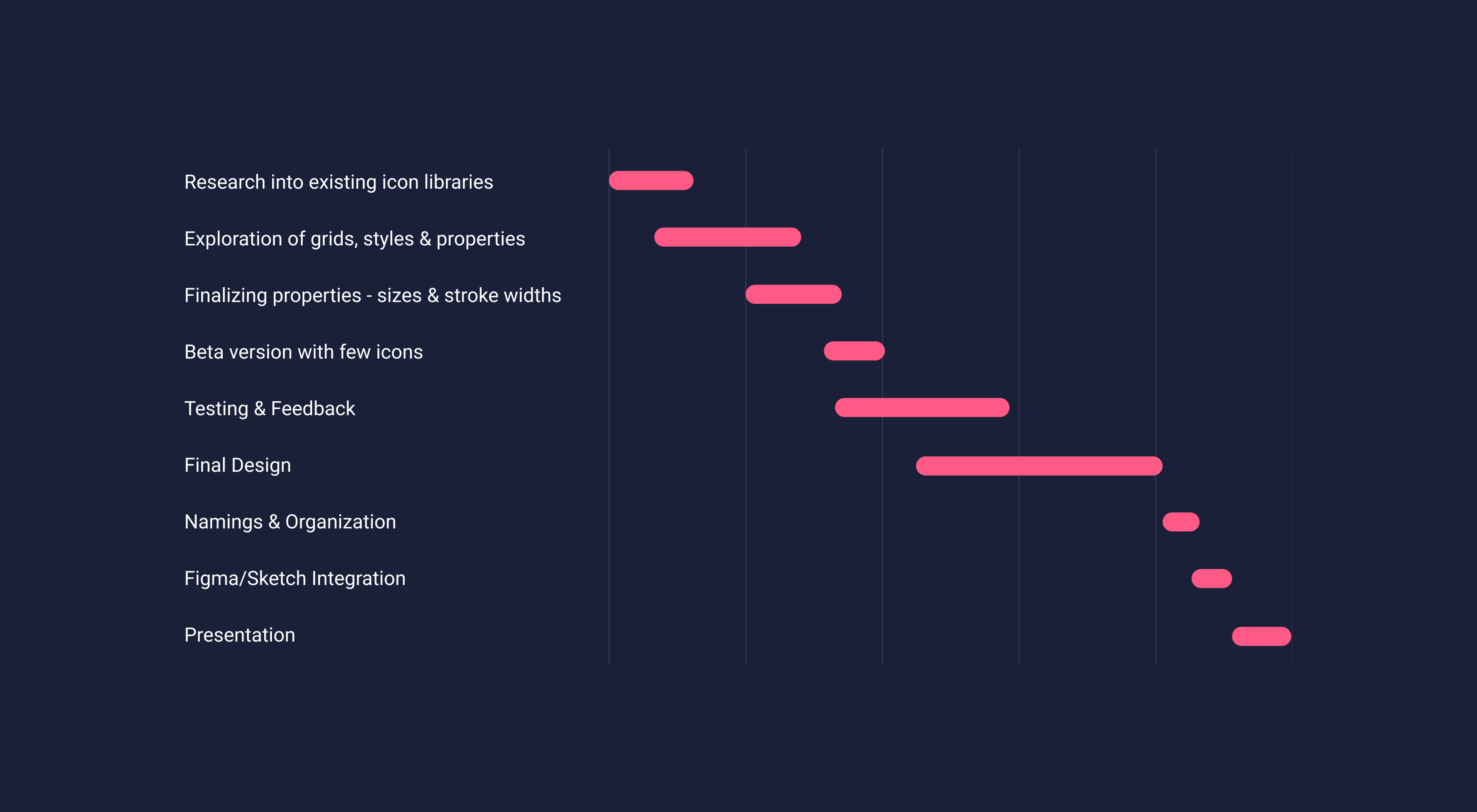
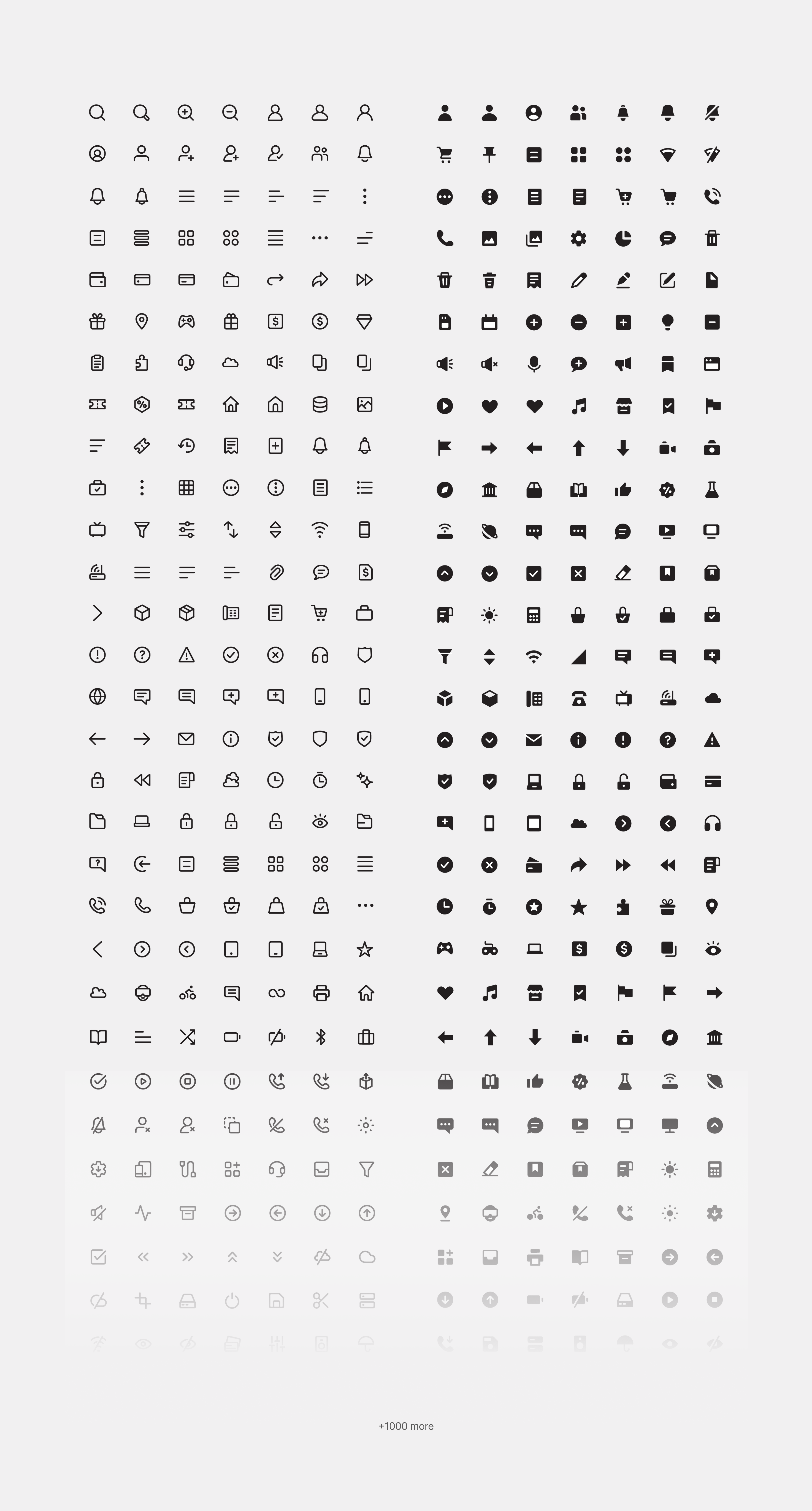
This project taught a lot, most importantly the skill of mastering patience. This was one of the longest & detailed projects that was taken up in the recent times. To create more than a 1000 icons, maintaining different styles, sizes, little details & nuances, testing them on user interfaces, getting some feedback from friends & peers from work, all in all it takes so much time & patience.
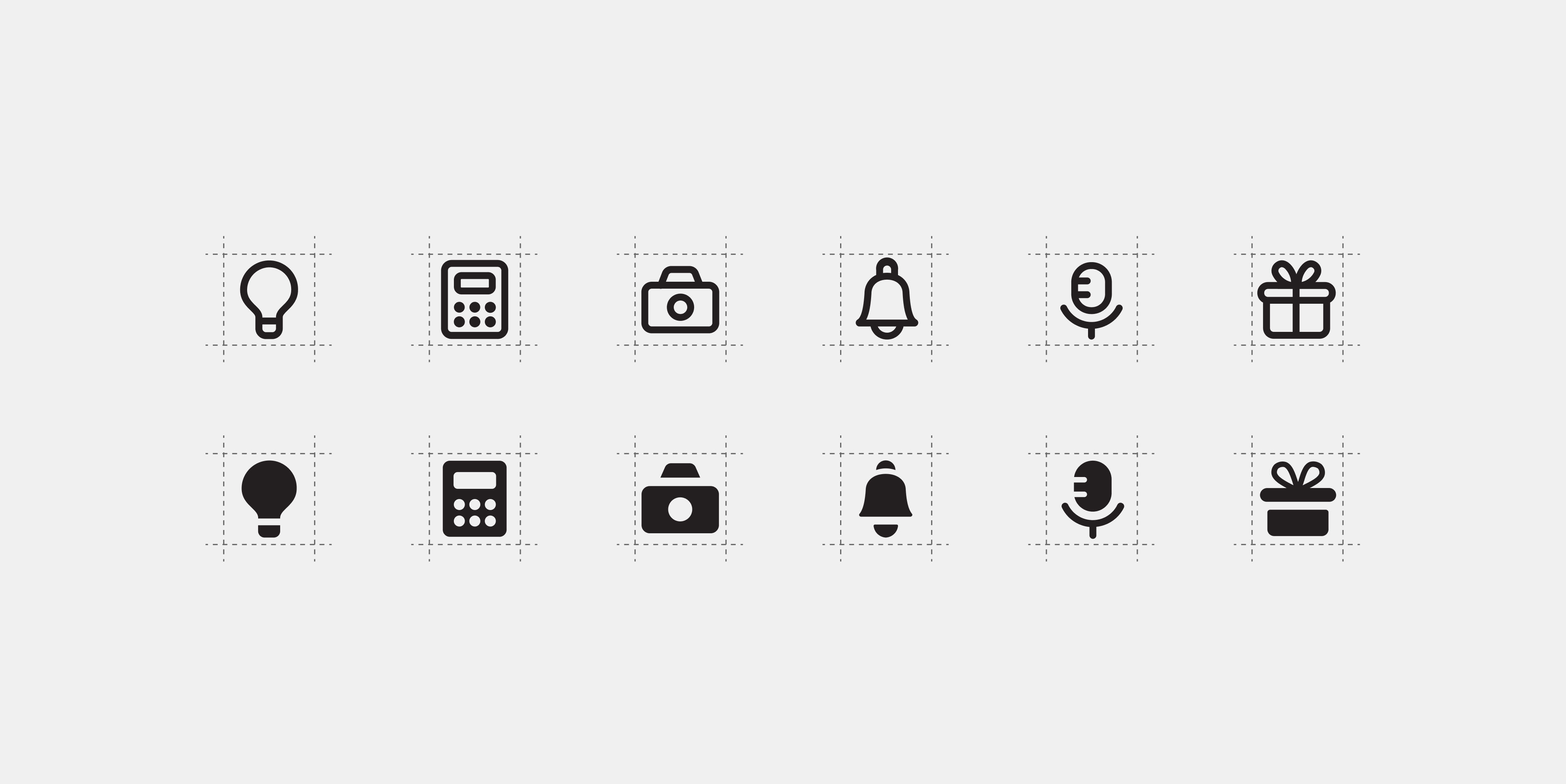
Also equally important was to spend a lot of time with basic foundations & taking a lot of feedback right in the beginning ideas & explorations. Since it was a huge task to make so many icons on the same family, any change in the middle would mean a whole lot of rework, so it was very important to get all the necessary feedback & foundations right, right at the beginning.
The enthusiasm & end goal kept the hard work going. Every obstacle seemed like a new opportunity to learn something new, and somehow in the end, it worked out. Also the feeling of creating & contributing something for the design community, which might make people's life easier, even if its 1%, seemed like a big enough motivation.
So overall, this project taught to dive in with a clear end goal, laying out a realistic outline & plan, for longer projects, spending a lot of time on the foundations rather than jumping into the design, taking feedbacks and a whole lot of patience, tenacity & perseverance.
Other Projects
Voyazio - A typography project
Graphic Design, Typography, Editorial
Mydox - A mobile app concept
Research, Branding, UX/UI
British Telecom(EE) - Call Center Platform
Research, UX/UI, Creative Direction
Iconstop - All purpose Iconset
Illustration, Iconography
Aarogya Setu - Redesign Concept
Research, Branding, UX/UI, Creative Direction
Scribbles
Guitar
Long Drives
Mechanical Watches
Art & Design
Classic Cinema
Stoicism
Dumbells & Jumpropes
Travels
Beaches
"The ultimate inspiration is the deadline" - Nolan Bushnell
Currently living, creating & playing in Pune, India.