Aarogya Setu.
Reimagined.

Aarogya Setu had been a key driving force in the battle against corona in India durig 2020 - 2021. The app did as much as it could, although leaving room for significant innovation & upliftment. Here is a new perspective on how the app could provide an even better experience to the masses at such hard times.
Project Type
Personal Side Project
My Role
Research
Interaction Design
Visual Design
Interface Design
Duration
3 Months
Tools
Figma

Overview

This is a redesign concept of the Aarogya Setu mobile app to create an easier, simpler and delightful experience. The key emphasis is on reducing the visual clutter and simplification of the user interface, while radically upgrading the information architechture & navigation, making it as simpler & easier as it can possibly be.
This doesn’t take into account all the features of the app as such, since this is more of a concept for exploration. However the key functionalities are considered, along with some very new added features & functionalities as well.

Process

Although design is an iterative process, here are few of the steps taken in reaching the end-result. And the process has never been strictly linear.

Existing App

The existing app has a ton of information all over the place, which makes it a little hard to scan the content, as a result of which, most of the information get ignored.
The main issue perhaps is the organization and the visual hierarchy of the massive content, making some key tasks quite difficult, which seemed like having a good scope of enhancement.

Research

As for any design problem, the solution is far from fruition without a proper research on the problem at hand. Based on the foundational principles of research, here is a bit of primary & secondary research done for this project.
User Research
Since we are trying to find issues & gaps with the existing app, asking actual users on the problems & painpoints seems to be one of the most easy wins. The user interviews are conducted on 4 participants with a bunch of insights. Based on the pointers, there are 2 personas created along with all the painpoints and oppurtunitiies. The details of the research can be found here.
Desk Research
Apart from talking to end users, various online resources, like mostly play store reviews, quora posts, comments etc has been reviewed as well to get a better idea of the issues with the app, and what could be some of the improvement areas.
Competitive Research
Since there are no other similar apps in the market for the same intent & functionality, so its a little difficult to do a thorough competitive research. However, since some of the features of this app is common in other exisiting apps as well like ‘booking appointments’, ‘infographics, ‘standard navigation’, ‘menu’, ‘feed’ etc., so a lot of patterns & interactions are inspired from existing apps in the market.

Problem Statement

Although the inherent intent of the app remains the same. However, part of this redesign activity, based on the self evaluation & research, this is the problem statement that has come up, which needs to be addressed.
Redesign the app, into a simple & easy experience, with some added crucial features, in which any user from teenagers to senior citizens can do the essentials, without having to struggle.

Ideation

Ideation have been in the form of paper sketches, rough flow diagrams, use cases etc. All of it helped in the formation of the foundational structure of the redesigned app. Some rough layout of the important pointers that shaped the ideation can be found here.
Information Architecture
Since, its not only about doing a visual design uplift, the intent is to redesign the overall structure of the app itself, so re-doing the information architecture was crucial. Also some new features & functionalities are added as well, so it was important to map out where exactly those features would fit, in the overall architecture. The details of the IA can be found here.

Wireframes

The information has been restructured and grouped in an entirely different viewpoint focussing on easier access & simplistic navigation. The full wireframes list can be found here.

Branding

The brand & visual language plays a very important role in the overall experience & perception of the app, so an attempt has been made to redefine the visual language with a more modern, simpler & cleaner approach.
Typography & Palette
To make the design clean & simple, the typeface is chosen carefully to make legibility the prime focus, yet being sufficiently modern & appealing.
The palette on the other hand is based on a soft orange tone, a close cousin of the saffron from the National Flag, which represents strength & courage of the country (which seemed to be quite apt for the app apparently).

Logo Design

A new & fresh logo is created to carry the essence of the new visual system of the app, bearing the same principles of simplicity, while adding a bit of quirk, imagination & creativity.

UI Design

The user interface is a classic example of how we can create a strong information hierarchy based on the most important & relevant features & functionalities for the countless users of this nation.
Along with the re-organized layouts & hierarchy, it carries a modern visual aesthetic with the elements of simplicity and clarity, to create an easy & delightful experience.
The final design is inspired from a lot of online references & UI benchmarking done while conceptualizing the UI. Details of the UI benchmarking & explorations can be found here.
Loading & Login
Considering the tough times in which people are using the app, the loading screen has a dynamic array of random motivational quotes, to uplift & inspire the masses to some extent. The login is pretty straightforward, with mobile number & subsequent OTP. Its a one-time login for the entire session with no futher authentication going forward.
Home & Covid Cases
The home screen has been radically redesigned, with a very strong sense of hierarchy and keeping only the most essential items in view. The navigation is also completely revamped with 4 clear and essential tabs - Home, Vaccine, Covidcare & Community.
Moving away from the text heavy representation of covid cases statistics, which being difficult to scan, a new graphical view has been carefully created, to give a very thorough as well as easy to understand visual representation.
Vaccines & Appointments
The vaccines page is now a completely new area where we can see our vaccination status for both doses in one simple view. We can even add Beneficiaries at the bottom of the page. Pending Vaccines are highlighted to notify the users and checking vaccination details or downloading certificates is like a breeze.
This is also a totally changed screen with an extremely simple & user friendly format to book vaccination slots. It’s literally like booking movie tickets now :)
Covid Care
This is a new page with the most essential covid related items all in one place. Now finding nearest hospitals with  available beds, oxygen, plasma etc is now way more easier to access.
Community
This is a new feature as well that has been added to the app, where people can share their stories, and most importantly can ask for help from the community.
Considering the fact that there are a lot of people & NGOs which are willing to help, this would be a great platform to bring them all together.
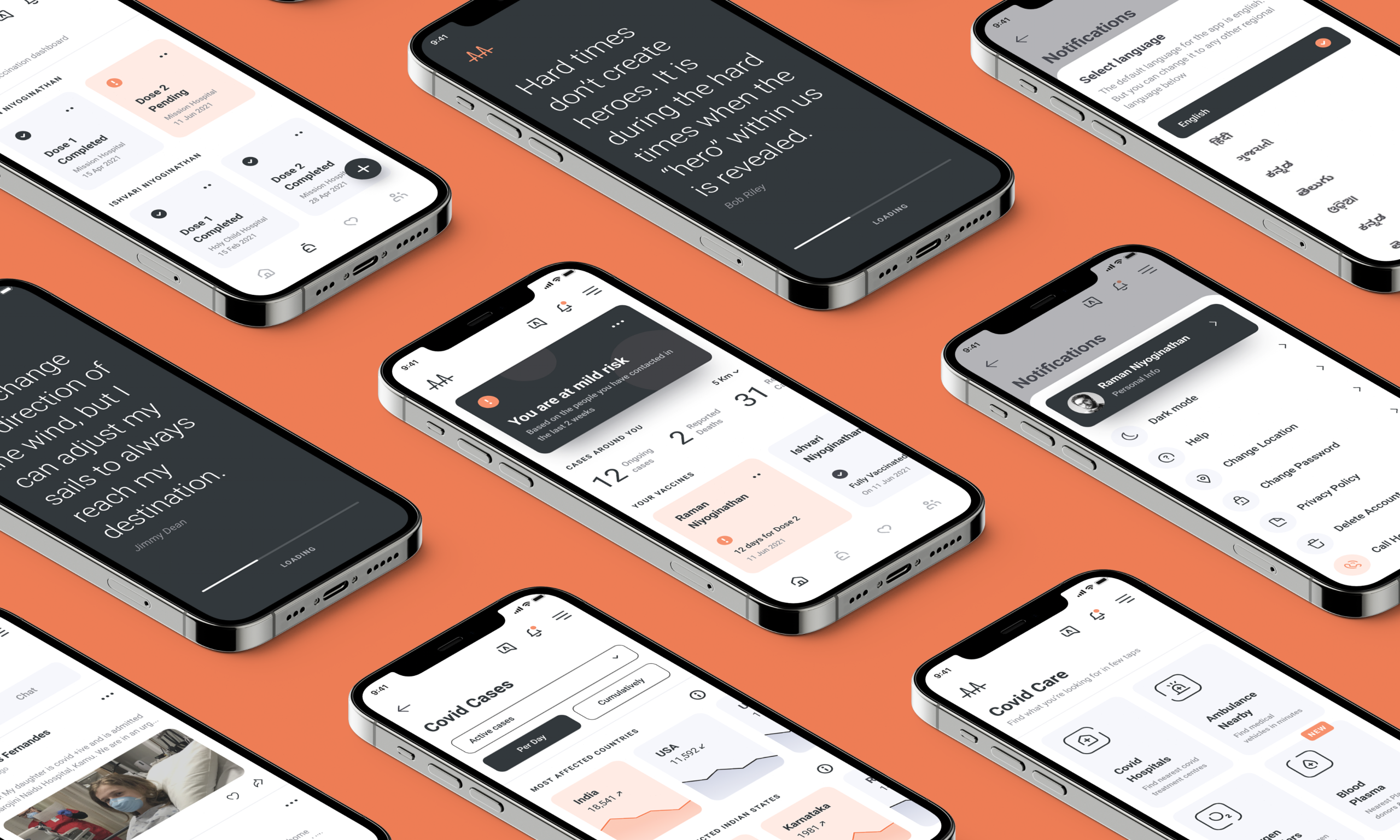
Notifications, Language & Settings
The notifications would show all government updates, notices, official announcements etc. which would massively help in creating the right awareness and stop spreading rumors with fake news and propaganda.
The Language & Settings are pretty straightforward with significant UI uplift, to have a simpler & easier experience, with the settings having some restructuring of information as well, to keep things relevant & to the point.
Iconography
A coherent series of icons have been created  with a uniform visual style and consistency, which adds to the fresh & refined aesthetic style of the app, leaving the users with a subconscious sense of delight.

Afterthoughts

As every project brings with it a bunch of learnings and experiences, and it's amusing that theres still so much to learn further for us.
One of the key learnings from this project has been the necessity to have a very clear visual direction right from the beginning and to stick to it. Otherwise, there’s always a lot of back and forth, which takes away a lot of time & bandwidth.
Also sticking to timelines has been a bit of challenge, as this was done at the spare time. So probably better time management & planning is something that should be incorporated going forward!
Other Projects
Mydox - A mobile app concept
Research, Branding, UX/UI
British Telecom(EE) - Call Center Platform
Research, UX/UI, Creative Direction
Iconstop - All purpose Iconset
Illustration, Iconography
Voyazio - A typography project
Graphic Design, Typography, Editorial
Aarogya Setu - Redesign Concept
Research, Branding, UX/UI, Creative Direction
Scribbles
Guitar
Long Drives
Mechanical Watches
Art & Design
Classic Cinema
Stoicism
Dumbells & Jumpropes
Travels
Beaches
"The ultimate inspiration is the deadline" - Nolan Bushnell
Currently living, creating & playing in Pune, India.